


 Welcome back!
Top of Mind from 3by400
Signs your business website is quietly losing leads (and what to fix first)

Your site still loads. The logo looks fine. Nothing throws a big error. And somehow the phone is quieter, the form inbox is thinner, and you’re not sure when it started.
That’s the annoying part. Lead loss on a “working” website rarely looks like a crash. It looks like a slow drip — a little friction here, a little doubt there — until people who meant to contact you just… don’t.
Below are the quiet signs that show up most often for small businesses that already have a site, plus what to fix first so you’re not guessing.
The contact path is harder than you think
You know where the contact form is. Your customer doesn’t.
If “call,” “email,” or “request a quote” lives in a footer link, a buried menu item, or three different places with three different labels, people bounce before they commit. On mobile, a sticky phone number or a clear primary button beats a clever nav every time.
What to check: Open your top three pages on your phone. Can a stranger start a conversation in under two taps?
The form asks for too much (or fails quietly)
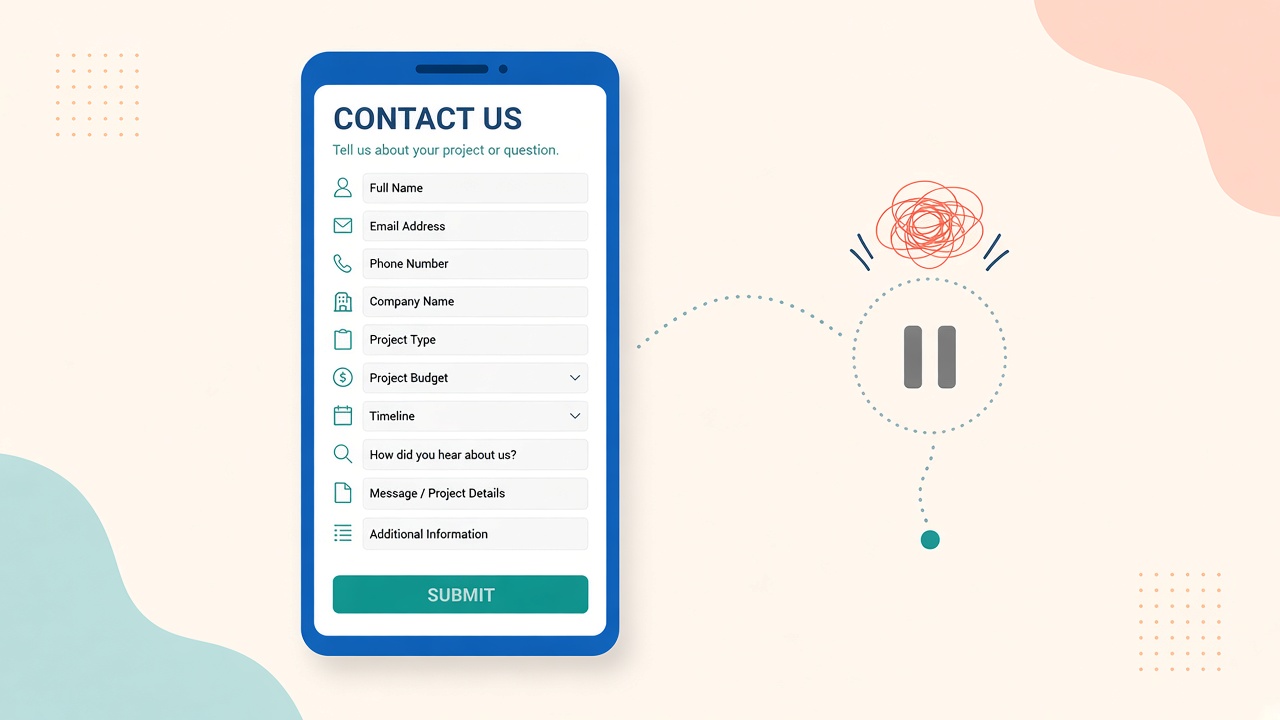
Long forms feel safe to you (“we need all the details”). To a busy owner, they feel like homework.
Name, email or phone, and a short “what do you need?” is usually enough for a first reply. Extra fields, captchas that break on mobile, and “submit” buttons that do nothing after a tap kill more leads than bad copy ever will.
What to check: Fill out your own form on a phone. If it errors, stalls, or asks for a life story, shorten it and fix the submit path before you touch anything else.
Speed and mobile layout push people away early
You don’t need a perfect Lighthouse score. You do need the home page, main service page, and contact page to feel usable on a normal phone over normal wifi.
Big uncompressed images, popups that cover the CTA, and text that requires pinching to read are classic silent killers. People don’t complain. They leave.
What to check: Load those three pages on your phone. If you wait, squint, or fight the UI, so does everyone else.
Trust cues went stale
Old copyright years, “as seen in” logos from a decade ago, an About page with no faces or dates, and zero recent reviews don’t always scream “scam.” They whisper “maybe later.”
Buyers compare you to whoever feels current and real. If your proof looks frozen in time, they pick the competitor who updated last month.
What to check: Dates on posts and case notes, review snippets with recent years, and a clear line on who you help. Refresh what’s true; cut what’s decorative and outdated.
CTAs compete or stay vague
“Learn more,” “submit,” and “click here” don’t tell anyone what happens next. Three equal buttons (“download,” “call,” “schedule,” “chat”) make people freeze.
One primary action per page is enough. Secondary options can exist — they just shouldn’t fight for the same attention.
What to check: On each key page, what’s the one thing you want them to do? Make that button obvious and specific (“get a quote,” “call us,” “book a consult”).
Pages answer the wrong question
Feature lists are fine. They rarely close the loop. Visitors usually want: is this for someone like me, what happens next, and how do I start without a big commitment?
If your service pages read like a brochure and never hand them a next step, they’ll admire the design and leave empty-handed.
What to check: Every important page should end with a clear next step and a short “who this is for” line — not just more paragraphs.
Leads never reach you (even when the form “works”)
Sometimes the site isn’t the leak — the follow-up is. Forms email an inbox nobody checks. Notifications go to an old address. Spam filters eat them. A “thank you” page shows, and the lead dies in silence.
From the visitor’s side, they did their part. From yours, it never happened.
What to check: Submit a test lead yourself. Confirm it lands where a human will see it within minutes, not “whenever someone remembers to check the CMS.”
What to fix first
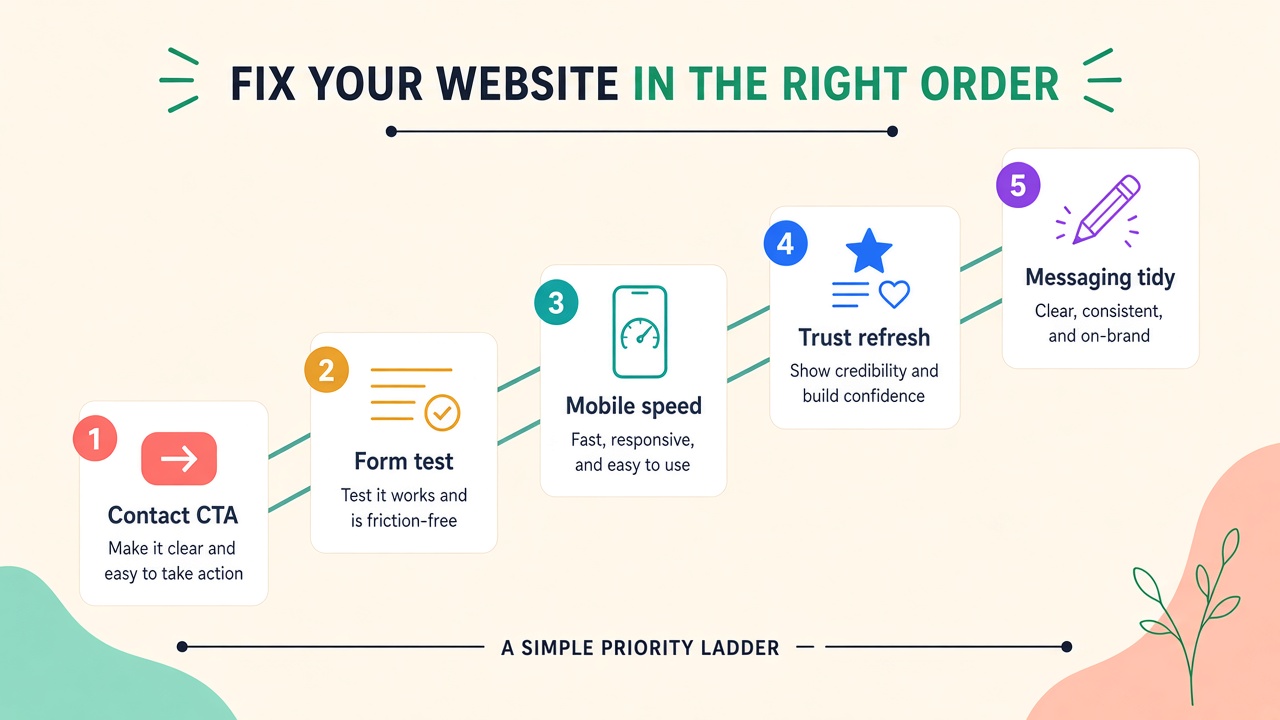
Don’t redesign the whole site. Sequence the work by impact:
- Make the primary action obvious on home, top service page, and contact.
- Strip and test the form on a real phone — including the confirmation that you actually receive it.
- Fix the worst speed and mobile issues on those same pages.
- Refresh trust — dates, reviews, who you help — so the page feels current.
- Then tidy secondary CTAs and messaging.
Most teams get more inquiries from that order than from a new homepage hero.
A simple weekend checklist
- Can a stranger contact you in two taps on mobile?
- Does a test form submission land in a live inbox?
- Do home + main service + contact feel usable on your phone?
- Is there one clear primary CTA per key page?
- Do trust cues look current (dates, proof, who you help)?
If two or more of those fail, you’ve found why leads went quiet — and you know where to start.
No redesign required. Just fewer quiet leaks.